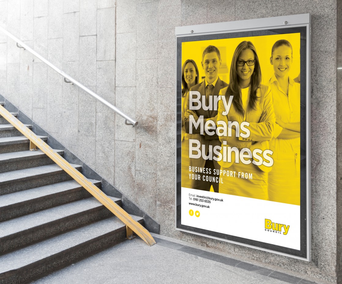
Rebranding and refreshing an SEO company.
Cure Digital are one of the clients who we collaborate on projects with on a regular basis. A working relationship where we design and build websites and they weave some magic on the websites SEO. They have grown quickly due to their skill and expertise. As they moved forward, they felt the time was right to update and rebrand their brand.
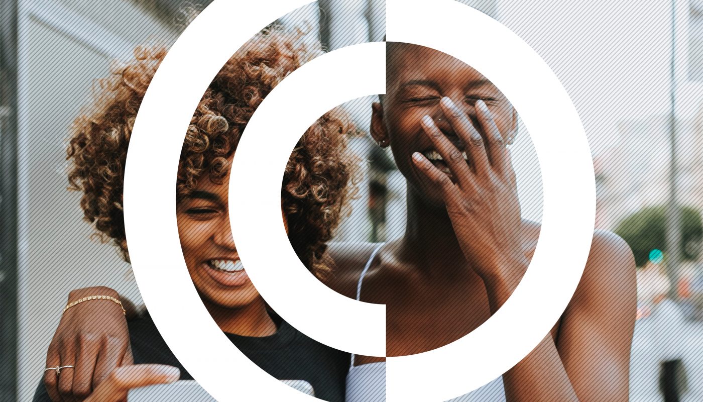
So with the original brand no longer representing where the business was now sitting with the huge growth in the last 12 months, we set to work on creating and developing a fresh new look for Cure Digital. We created a brand inspired by the clients own tag line ‘make it better’. The whole tone of the logo created pushes boundaries and inspires trust. A perfect combination for any client looking to rebrand their image.
Styled…
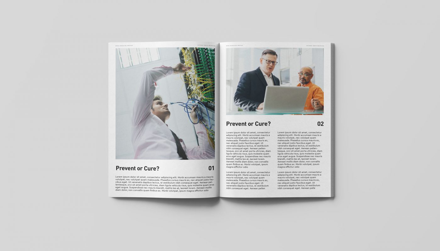
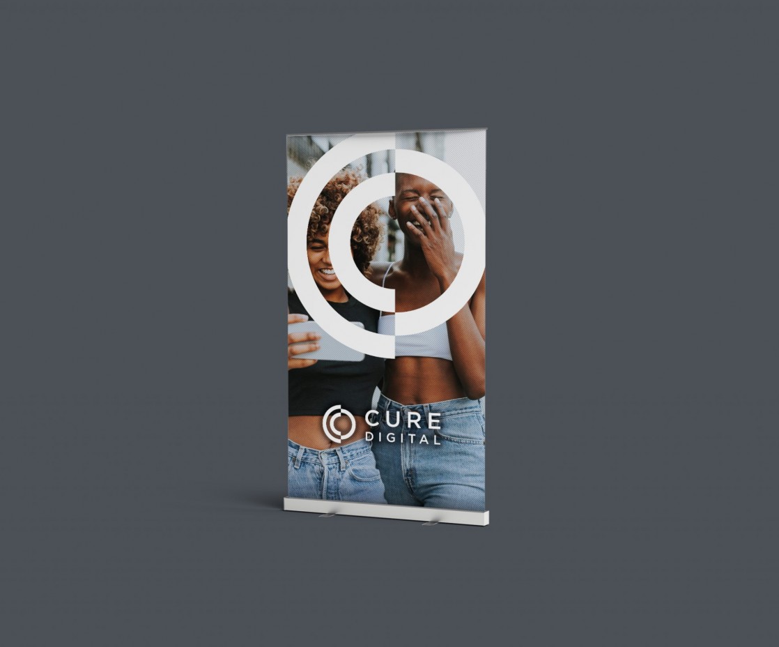
The Monogram style logo was created using both the C and the letter D from the name of the company. The curves of the letters C and D, work perfectly together. Forming a strong icon that can be used throughout all the promotional material for the business moving forward. Once the new brand was signed off and looking really strong. We quickly moved through on to creating printed material which the company could use at both exhibitions and meetings with prospective clients.
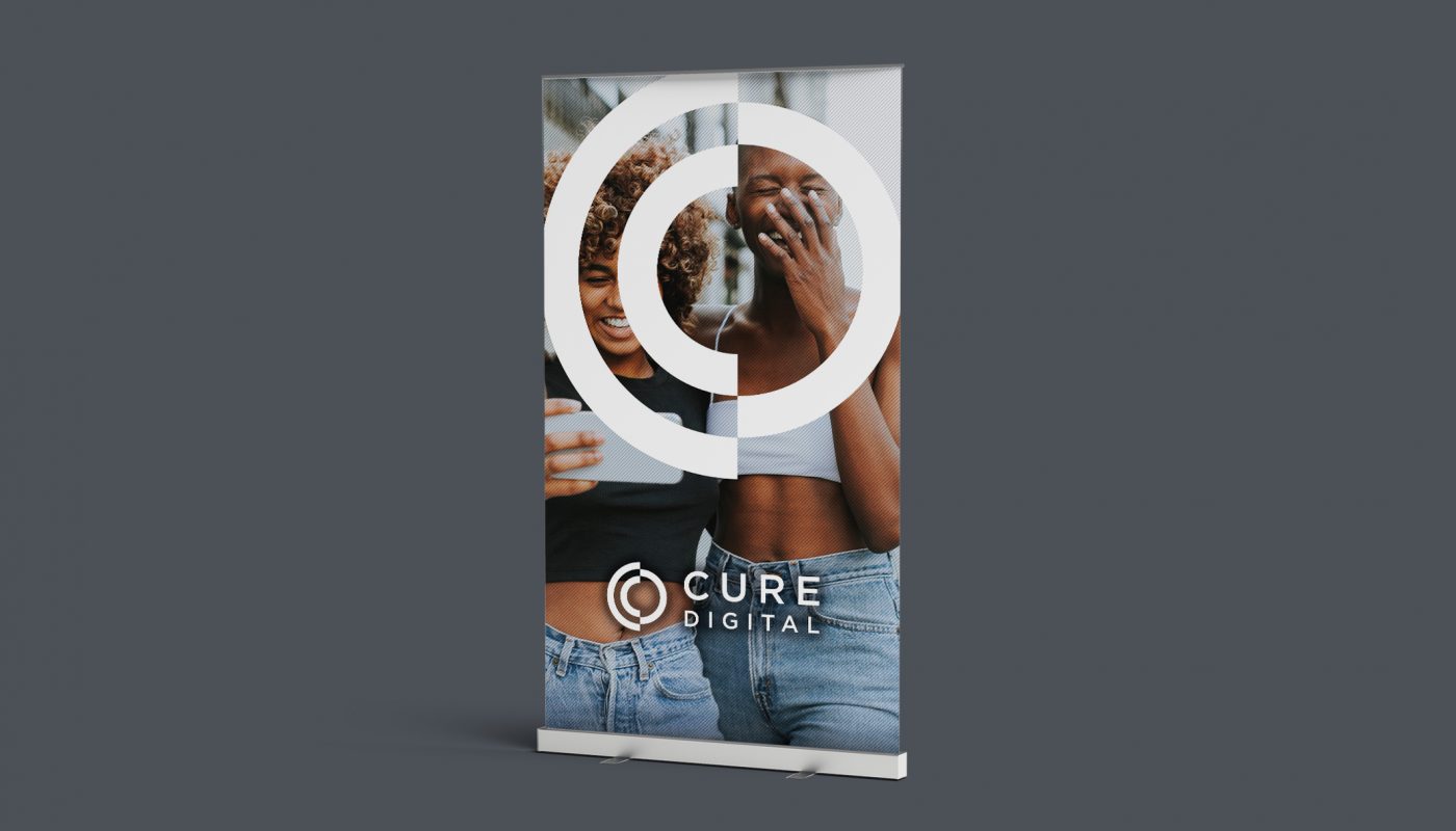
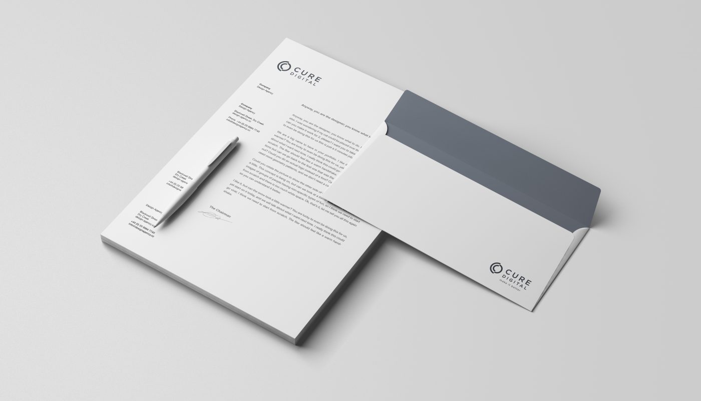
The bold icon in the logo works fantastic standing on its own to really grab the eye. For example, as you can see on the pop up banners created, the bold rebrand has seen a strong identity develop. Whilst new stationery was commissioned that when passed out to any clients, continued to impress and carry the brand forward. As a rebranding exercise, this has worked perfectly.
As a project we are looking forward to developing the Cure Digital brand. Seeing how it engages with potential clients…. We love this brand.