Rebrand for Bury Means Business
A bold new identity
We were invited to pitch for the rebrand of Bury Means Business, a key department within Bury Council responsible for promoting, supporting, and growing the local business landscape. Their remit spans everything from nurturing start-ups to attracting well-established companies to invest within the borough of Bury.
Winning this pitch was a proud moment for us, and we moved quickly into the discovery phase. Rather than making assumptions, we organised conversations with both local businesses and organisations based outside the area. Speaking to companies beyond Bury was a deliberate move. It gave us valuable insight into what would genuinely attract businesses to relocate or invest in the region.
The feedback was clear. The brand needed to feel modern and fresh; bold, confident, and eye-catching… but with a distinct local identity. That final point proved to be the most interesting. What does “local identity” actually look like in a way that feels authentic rather than forced?
The breakthrough came from an unexpected place: a visit to Bury FC at Gigg Lane. The club crest features the Latin phrase “Vincit Omnia Industria”. A quick translation revealed its meaning — “Industry Conquers All.”
That word, industry… became the anchor. It connected perfectly. Bury has a rich industrial heritage, and at the same time, the Council’s ambition is to attract new industries and forward-thinking businesses into the area. From that single insight, the brand direction became clear.
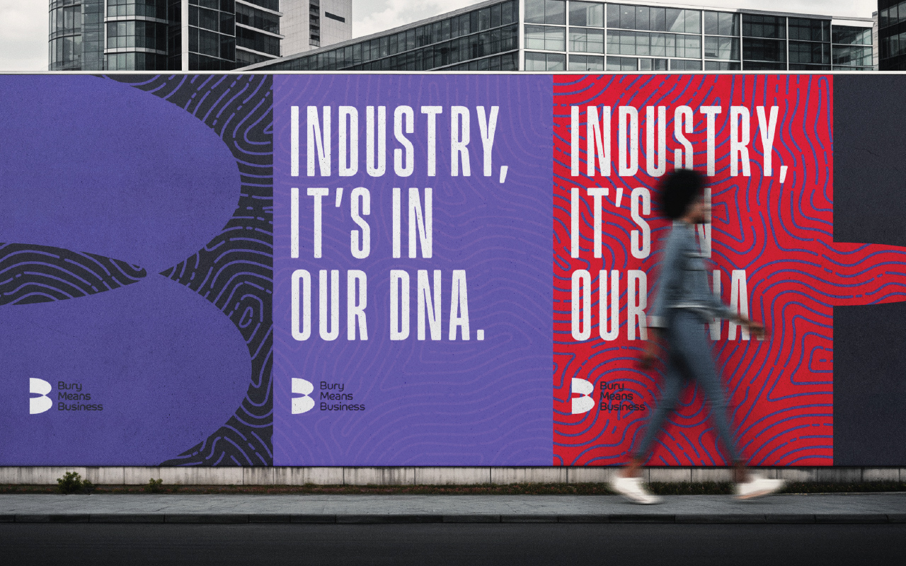
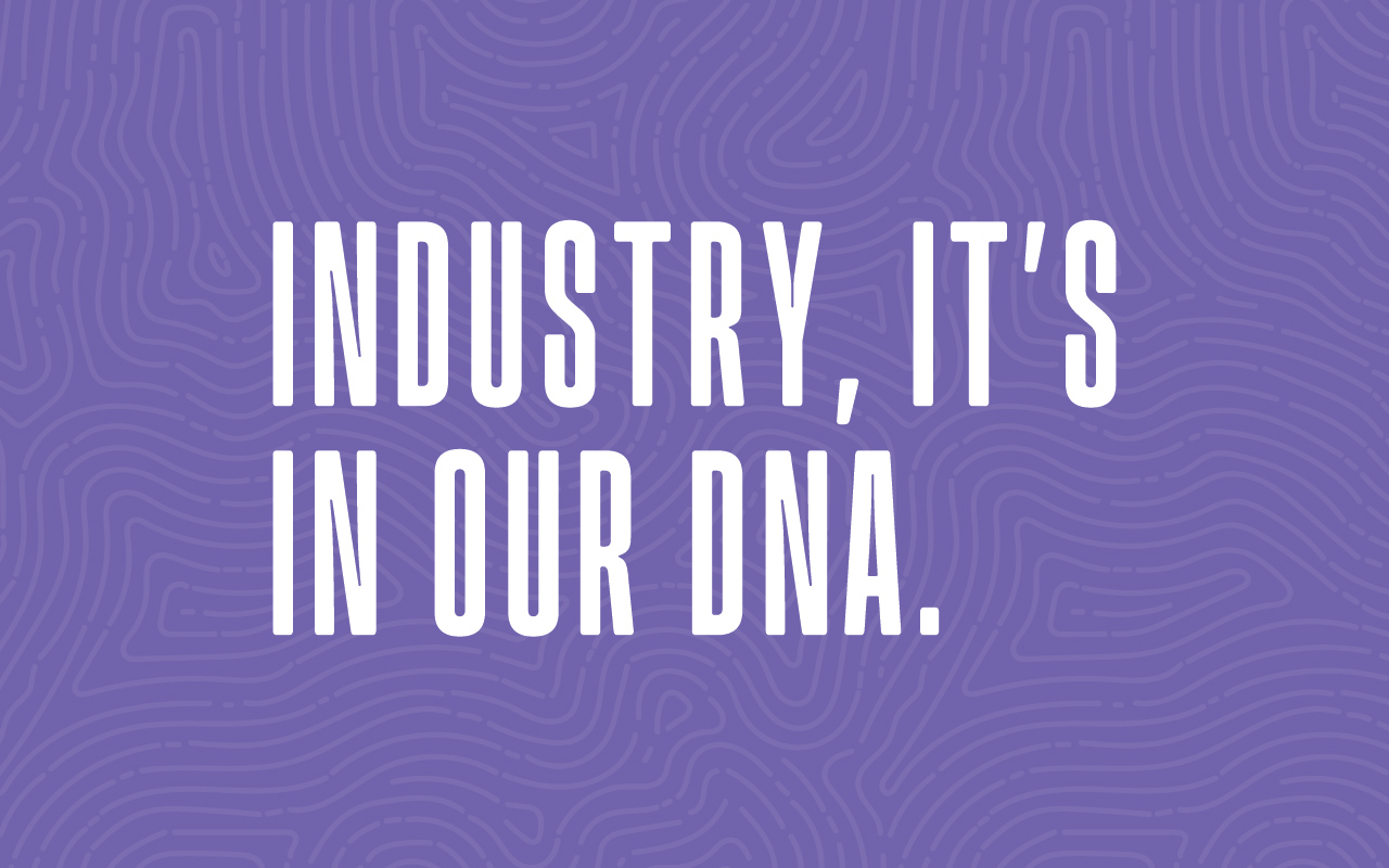
We developed the strapline: “Industry. It’s in our DNA.”
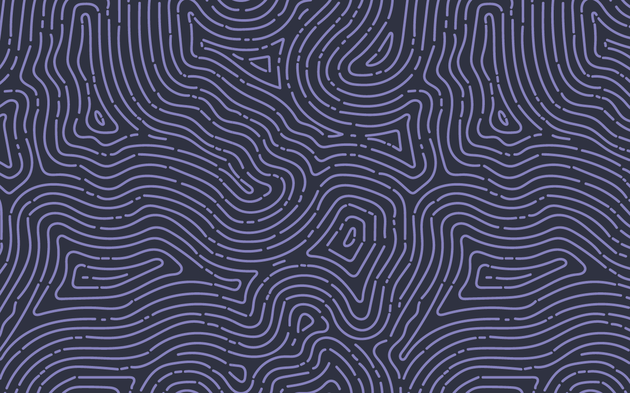
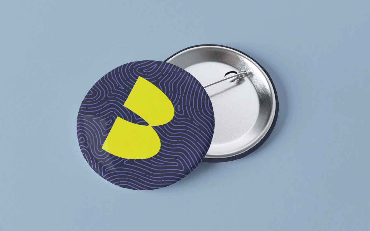
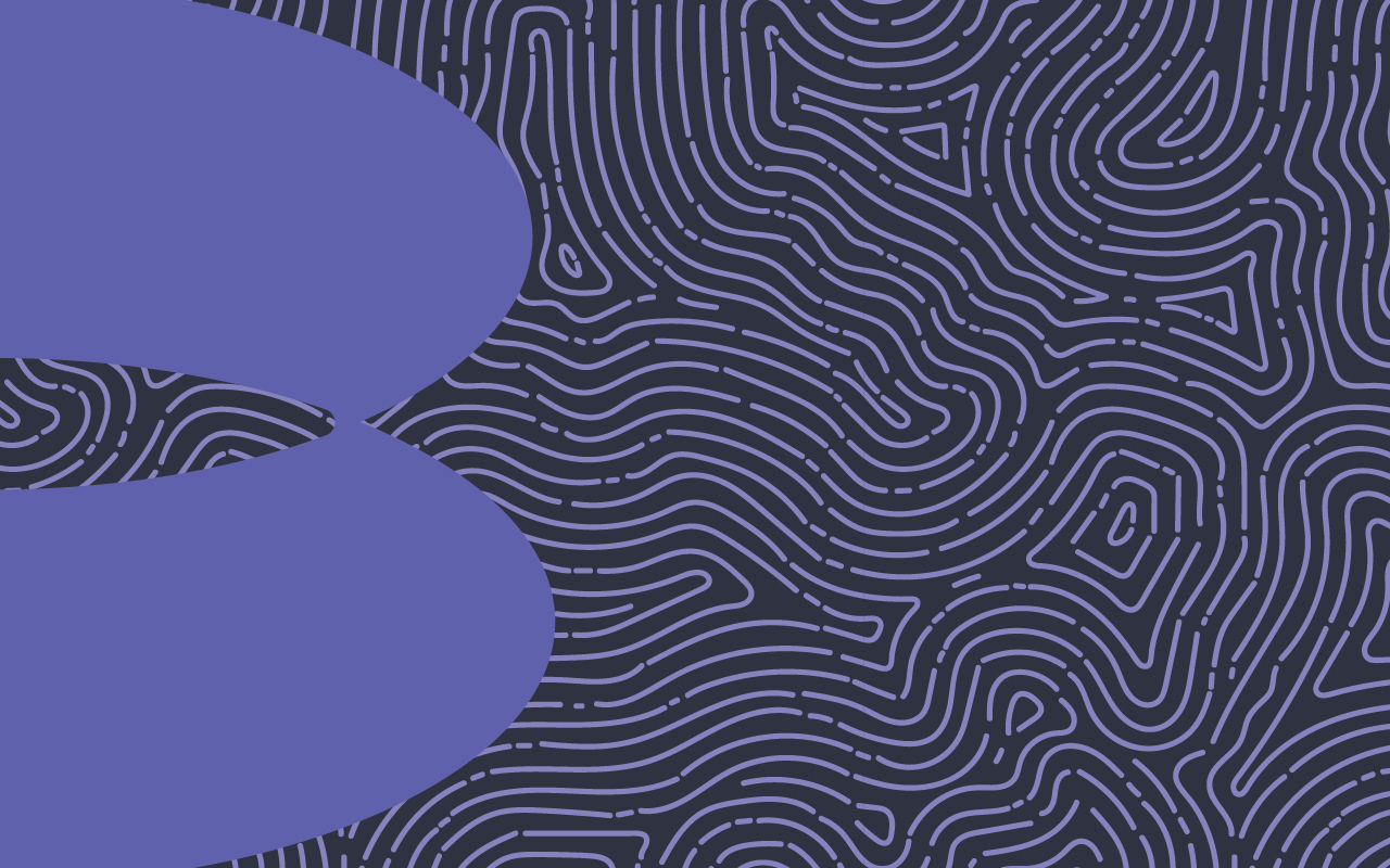
This idea then evolved visually into a fingerprint-inspired DNA pattern, a flexible graphic device used throughout the brand in a variety of colourways. It symbolises individuality, identity, and growth, while reinforcing the idea that industry is embedded within Bury’s past, present, and future.
Alongside this, we completely reimagined the logo. The previous mark, if we’re being honest, wasn’t really a logo in the true sense — it was simply text placed within a circle, lacking both impact and flexibility. Our solution was to introduce a bold, distinctive “B” icon to sit alongside the name. This new marque works not only as part of the full logo, but also as a strong standalone identifier across digital, print, and environmental applications.
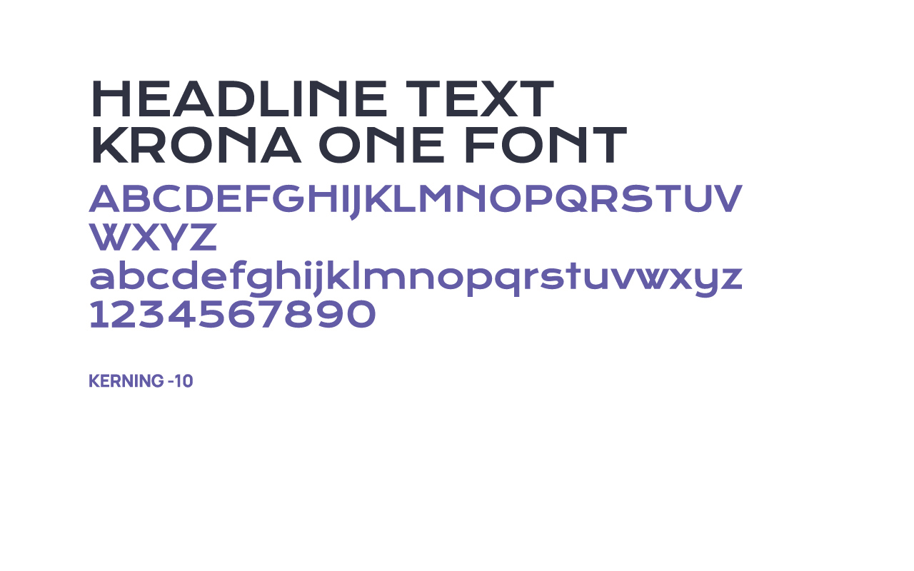
Supported by a confident, modern colour palette, the new identity was designed to be both striking and adaptable. Multiple colour variations ensure the brand remains consistent and recognisable across different platforms, backgrounds, and use cases.
The result is a brand that feels contemporary, confident, and rooted in something real, a visual identity that reflects both Bury’s heritage and its ambition for the future.